For my first logo iI decided to use the Vineyard Vines happy whale logo! I really like the Vineyard logo because it is a friendly unique logo for a clothing brand. I choose it because it was the logo that sticks out the most to me in my closet of clothes. The pink whale gives off a happy vibe to consumers that make them want to buy it. The whale can also be easily changed in order to adapt to a season or holiday easily making their product more diverse. The whale has been a strong logo to brand their product around. Walking into a Vineyard Vines store is like walking into a brand new Christ-craft yacht. The product appeals to people with a classy simple taste. In an industry where rival companies like Brooks Brother and Ralph Lauren try to thrive off the fact that they have been around longer which makes them “classier” Vineyard Vine’s simple yet cute logo has been able to appeal to men and women consumers.
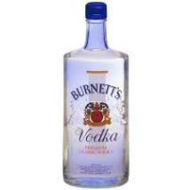
The logo that I picked that I did not like was the russian looking Burnett’s vodka logo. Yes it may be cheap alcohol, but the lack of effort the company has done to solidify its brand almost equates to how bad their product tastes. The logo itself looks like some sort of old school USSR symbol used to create propaganda during the cold war. The different typefaces used all over the bottle also makes the overall package inconsistent and boring. Although one redeaming quality about Burnett’s is the fact that they have an endless amount of flavors of vodka. I think one way they could make the logo better is to come up with a new image and consistently use it on all of their products. That way people will recognize the product as a unique way to add flavor to their adult beverage.

